

Typography has the power to communicate, reinforce brand identity and guide the audience’s perception. With so many options available, each with its own particular features, the process can seem complex. Below, we show you everything you need to choose the perfect typography, from the most common typefaces to important factors such as legibility, contrast and font pairing. Let’s continue!
Table of contents
- Typography styles: when to choose each style
- Key tips for choosing typography according to brand personality
- The most important factors when choosing typography
- Practical tips for combining fonts effectively
- Common mistakes when choosing typography and how to avoid them
- Tools and resources to test and compare typefaces
- How to choose the right typography with Cashdisplay
Typography styles: when to choose each style
Typography is made up of a wide variety of styles grouped into different categories, each designed to fulfil specific functions. For those looking for how to choose the right typography, understanding these styles is the first step.
Serif and Sans Serif: How to choose the right font
Serif and Sans Serif fonts are probably the best known. Serif fonts, which include small strokes at the ends of letters, add a touch of elegance and professionalism. They are an ideal option for projects that aim to convey a classic or trustworthy image, such as printed media or formal documents. On the other hand, Sans Serif fonts remove those details, giving them a more modern and minimalist appearance. These are especially useful in digital formats where clarity is very important, such as websites and apps.
Choosing a Serif font can be ideal for long and formal texts, while a Sans Serif font is preferable for screens and contemporary-looking designs.
Italic and Script: Choosing typography for a personalised touch
Italic or Script fonts are characterised by simulating handwriting, which adds a more personal and unique feel to the design. They are ideal for decorative uses, such as invitations or logos that aim to stand out. However, they should be used carefully, as they can affect legibility in long texts or very small sizes.
These typefaces are perfect for highlighting names, slogans or keywords within a design, adding a distinctive style.
Display and decorative fonts: Choosing impactful fonts
Display or decorative fonts are specifically designed to attract attention. These fonts usually have an eye-catching style, perfect for headlines or visual elements that need to stand out. However, they can be difficult to read in longer texts and should be used in moderation.
If you are looking to choose a typeface for large headlines, covers or banners, these fonts are ideal.
Key tips for choosing typography according to brand personality
Each typeface has the power to convey a personality, which makes its choice an essential part of brand identity. Choosing typography should be aligned with the values and style you want to project, so that the audience visually identifies the essence of the brand.
For example, for a luxury brand, a Serif font could reflect sophistication, while a more minimalist Sans Serif would project a modern and accessible image. If it is a youthful and energetic brand, a Script or decorative typeface can communicate creativity and enthusiasm. It is essential that the typeface you choose represents your brand as well as possible, so you can deliver strong messages and keep everything cohesive.
When choosing a font for a logo, it is essential that it is legible and maintains its essence in different sizes and applications. The logo typography must be easy to recognise and perfectly represent the tone of the brand.
The most important factors when choosing typography
Legibility and clarity: How to choose an easy-to-read typeface
Legibility is undoubtedly one of the most important factors when choosing typography. It does not matter how attractive a font is if it makes reading difficult. Legibility depends on aspects such as letter size, spacing between characters and the shape of each letter. Serif and Sans Serif fonts are usually the most legible for long blocks of text, while Script or decorative fonts are best limited to titles and highlighted elements.
In addition to choosing the right typography, using styles such as bold and italic can improve legibility and emphasise specific elements of the text. Bold helps highlight keywords or crucial concepts, making quick reading easier and guiding the reader’s attention to important points. Italic, meanwhile, is ideal for highlighting quotes or technical terms without interrupting the visual flow of the text.
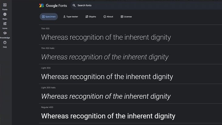
When testing different typefaces, it is advisable to observe how they look in different sizes and backgrounds, making sure the letters are clear and easy to distinguish. Here we emphasise a small sample, but do not limit yourself: test and analyse which one best suits your needs.
Size, spacing and style to choose the right font
Each typeface has specific characteristics in terms of size and spacing that affect its appearance. To choose typography that looks good, it is essential to adjust line spacing and kerning according to the design. A very tight typeface can make reading difficult, while wider spacing provides a more airy and easy-to-read appearance.
Testing different spacing options helps you find the perfect balance, ensuring that the font maintains its style without compromising legibility.
Contrast and colour when choosing typography
Contrast and colour are also essential when choosing a font. For digital projects, contrast is necessary so that the text is easily visible on any background. In printed formats, colours and contrast can define how the typography is perceived and how it stands out against other visual elements.
Always test how typefaces look on the different backgrounds where they will appear, and choose colours that reinforce their visibility and harmonise with the design.
Proportion between uppercase and lowercase letters
This aspect, although often overlooked, is important to guarantee legibility. Look for typefaces in which uppercase and lowercase letters are balanced in proportion. If uppercase letters are disproportionately larger, it can affect reading flow and the perception of the text.
Special characters and their importance
When choosing typography, it is essential to check that it includes all the necessary special characters. For example, in Spanish, it is essential that it contains the “ñ” and accents, as many typefaces are not designed for these elements, which can limit their use in certain contexts.
Aesthetic qualities that convey emotions
Each typeface evokes different emotions and meanings through its aesthetic characteristics. For example, serif typefaces, such as Times New Roman, are ideal for formal projects thanks to their classic and elegant style. In contrast, sans serif typefaces, such as Helvetica, are more suitable for brands that want to convey modernity. When choosing typography, you should base your decision on functionality and on how it reflects and communicates the brand identity.
Practical tips for combining fonts effectively
Combining typefaces correctly can add depth and appeal to any design, but it is not always easy. There are some tips we will provide to make choosing complementary fonts simpler.
How to choose fonts that work well together
When it comes to choosing fonts to combine, less is more. The recommendation is to limit yourself to two or three typefaces in a single project to avoid overloading the design. Generally, use one main font for the body text, a secondary one for headings and, optionally, a third for details or decorative elements. For example, you can combine a Serif font for the text and a Sans Serif for headings, creating effective visual contrast without losing coherence.
Choosing a primary and secondary font in a design project
To decide on the primary and secondary font, it is important to think about the visual hierarchy you want to achieve. The primary font should be legible and not distract the reader.
The secondary font can be a little more expressive, helping to highlight the most important elements. For example, on a website, the primary font will be used in the body text, while the secondary font can stand out in headings and calls to action.
Choose typefaces that contrast in style, but maintain visual cohesion. Preview tools, such as Google Fonts, can help you see how different fonts work together.
Common mistakes when choosing typography and how to avoid them
When choosing typography, it is easy to make some mistakes that can affect the visual impact and functionality of the design. Knowing these mistakes helps avoid them and improve the final presentation.
Choosing inappropriate typography for the target audience
It is common for a typeface that seems modern and attractive not to be suitable for the project’s audience. That is why it is always necessary to consider who the design is aimed at. Choosing decorative fonts for a professional audience can reduce credibility, while choosing a typeface that is too serious for a youthful design could make it lose appeal.
Always evaluate typography from the audience’s perspective, adapting the style to their preferences and expectations.
Using too many typefaces and complicating the design
Excessive use of different typefaces is another common mistake. As we said before, more than three different fonts in a single design can make it look cluttered and difficult to read. Consistency is essential to achieve an attractive design.
Choose simplicity and coherence, limiting the number of fonts and maintaining uniformity throughout the project.
Not considering the context of use when choosing the font
Each project has a different context, whether digital, printed or multimedia, and each medium affects the perception of typography. A font that looks clear in a digital design may be difficult to read in a printed format, and vice versa.
After choosing typography, you should test it in the context where it will be used, ensuring that it works well in the final format.

Tools and resources to test and compare typefaces
To choose the right typeface among so many options, there are multiple tools that allow you to test and compare fonts in different contexts.
- Google Fonts: One of the most popular tools for previewing and selecting free fonts. It allows you to combine different typefaces and see how they look in text paragraphs.
- Adobe Fonts: Includes an extensive collection of premium typefaces, with advanced options to preview and adjust spacing and size.
- Font Pair: Especially useful for those looking for font combinations, suggesting pairs of typefaces that work well together.
- WhatFont: A browser extension that allows you to identify and test fonts directly on any web page.
Taking advantage of these tools makes the process of choosing typography much easier, allowing you to experiment and adjust every detail before making a final decision.
How to choose the right typography with Cashdisplay
We understand how important it is to choose the right typography for each occasion, since otherwise any project requiring a particular typeface can be ruined. That is why at Cashdisplay we explain everything you need to consider, from its legibility to the situations in which each one is recommended, so you can choose the one that best suits your tastes and needs.


